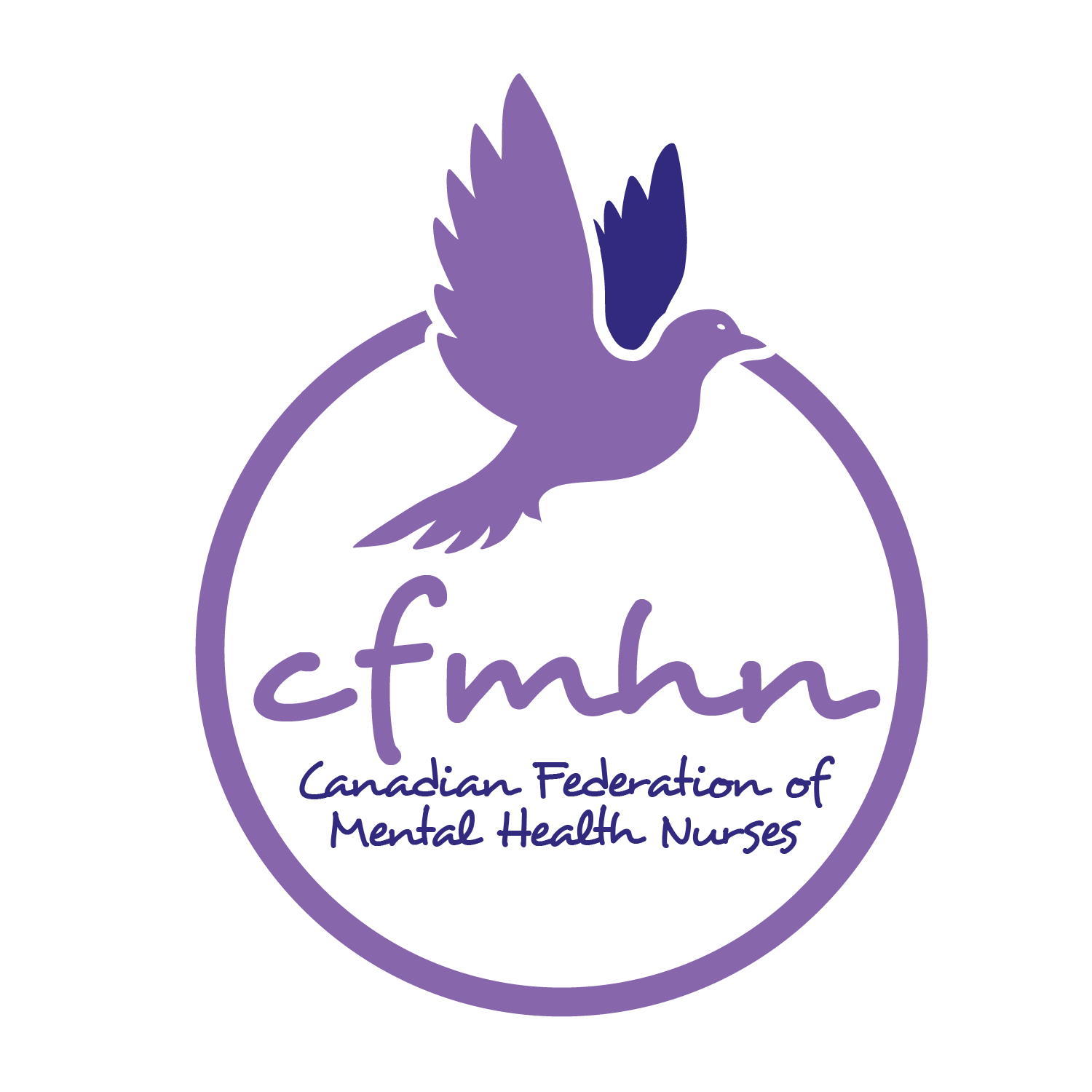
Interpretation of the new CFMHN logo

Dove:
The symbol of CFMHN from its origin, representing hope, inner peace and nurses’ personal and professional health and well-being.
Eye of Dove: Indicates CFMHN as a living entity that is active, growing, learning, curious and impactful.
Colours:
The colour Purple is recognized as a symbol of awareness, mental health, creativity, passion, and well-being. Our logo depicts two shades of purple to reflect our values of diversity, inclusivity and partnerships including the populations and people for whom we care. The colours reference CFMHN collaborative approach nationally, regionally, and locally, with communities and other sectors.
Shadow of Wing: The deeper purple colour symbolizes the diversity of who we are as nurses, the various areas of our practice, nurses’ ongoing professional growth, development, competencies, and achievements.
Open Circle:
A symbol of openness, transparency, inclusivity, compassion, and respect. The open circle also allows for creativity, innovation and new evidence to inform nursing practice and improve mental health and wellness outcomes.
Orientation of the Dove Flying Upwards:
Indicates hope, meaning, purpose, recovery, optimism and growing capacity.
Wings Open in Flight:
Indicates a courageous, hopeful, forward movement, towards recovery and speaks to the partnership of the healing journey that is a part of nursing practice. It represents nurses as lifelong learners who promote advocacy, compassion, and ways to improve practice and care.
Font (Desyrel Regular):
Contemporary, approachable, readable, and accessible. This speaks to the nurses’ adaptation to the continuum of mental healthcare across all ages and sectors.
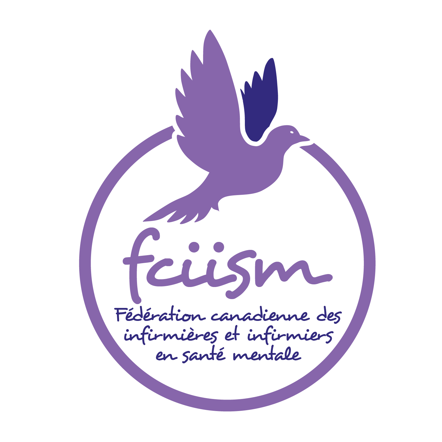
French Translation:
We have translated our logo, and the name of the CFMHN, to the French language in respect of our francophone colleagues and partners.